In this lesson you will learn how to create a form that can be used in web applications and/or used as form for a user task in business process applications.
mondCloud provides the ability to create responsive UI (HTML5) forms. The forms can be created using standard browsers and does not require any client component or software on the user systems. mondCloud provides a comprehensive set of features for defining complex forms with panels, tabs, sections, exhaustive set of form elements that are required to provide a better user experience.
Navigate to Designer -> Data Form Designer. List of existing forms will be displayed
Step 2
On the menu bar, click Add New (a new window will open).
mondCloud Form Designer
Enter the name of the form and click Save. The form will be saved and a form design window will be displayed.
mondCloud Form Designer
Overview of the Form Design Window
The Form Designer frame has two tabs. The first tab is the Design tab where you will define the fields of the form and the second tab is the Preview tab where you can preview the form as the form would appear in real-time. The preview facility will allow you to make adjustments to the form design to make it aesthetically pleasing.
On the menu bar, there is a property button which you have to use to define the title and overall layout of the form. There is also a Save button which will allow you to save your changes to the form. You have to save your changes before you can preview the form. Without saving, the preview will render the previously saved form.
You are also provided with a Form Elements Toolbar, with different form elements that can be added into the form.
Step 3
Defining the overall layout of the Form
Click Properties on the menu bar. The Form Properties window will open.
mondCloud Form Properties Window
If required, you can change the title of the form in the Form Title field.
In the Form Width field, you can optionally specify the overall width of the form in %. The size of the form will be determined by applying the % specified here to the overall size of the parent container class in which the form is displayed. For example, if the width of the parent container frame is 1000 pixels and you specify the width of the form as 75%, the form will be 750 pixels wide.
Navigate to the Tabs tab. A tabs definition table will be displayed.
Tabs Definition Table
Click Add icon in the bottom of the table to insert a new row in the table. Each row in the table represents a tab in the form. You can assign a ID for the tab, Enter the name for the tab as it has to be displayed on the form.
Click Save icon in the bottom of the table.
Navigate to Sections tab. A Section definition table will be displayed.
Section Definition Table
Click Add icon in the bottom of the table to insert a new row in the table. Each row in the table represents a section in the form. You can assign a ID for the section, enter the name for the section as it has to be displayed on the form.
Sections in form can be collapsed and expanded. Set the Collapsable checkbox to checked if you want the collapsable feature. The collapsable feature will help in viewing a form when there is lot of content in the form with multiple sections.
For the Sections that can be collapsed, should you want the section to be shown in collapsed state by default when the form is shown for the first time, you can set the Collapsable checkbox to checked.
In the Colour column, you can enter the colour in which the section title has to be displayed in the form.
In the Width column, you can specify the width of the section. Using the Width feature, you can include more than one section side by side by side.
In the Parent column, you can select the tab in which the section has to be included.
Close the Form Properties window.
Click Save Form to save your changes.
Step 4
Defining Form Enumerations
Forms will normally contain drop down fields, radio buttons and grouped check boxes. The values to be shown in drop down fields, the different values to be shown for a set of radio buttons or the different checkboxes to be shown for a grouped check box are called enumerations. The enumerations to be used in a form are be to defined in the Form Properties window.
Navigate to the Enumerations tab. Two tables will be displayed. The enumeration table is for defining the various enumeration names. Enumeration values table is for defining the possible values for each enumeration. For example, gender is an enumeration and male and female are the values of the enumeration.
Enumerations Table
In the Enumerations table, Click the Add icon in the bottom of the table to insert a new row in the table. Each row in the table represents an enumeration. Enter the name for the enumeration.
Click Save icon in the bottom of the table.
Select an enumeration by clicking on the row in the enumeration table. The title of the enumeration values table will display the enumeration for which the values can be defined.
In the Enumeration Values table, Click the Add icon in the bottom of the table to insert a new row in the table. Each row in the table represents an enumeration value. In the Value column enter the value of the enumeration as it has to be displayed in the drop down or for the radio buttons or the check boxes. For example, in the screenshot, Cleared, Rejected and On-hold are the values for the enumeration called AML Due Diligence Decision. These values will be displayed in the dropdown in the form. In the Key column, enter a number or text to be used as the key for each of these values. The key will be used internally by the system for business logic.
Click the Save icon in the bottom of the table.
Close the Form Properties window.
Click Save Form to save your changes.
Step 4
Defining Form Fields
You can define form fields by adding rows in the Form Fields table. In order to add a field you can either click on the field icon on the tool bar or you can click the Add icon in the bottom of the table.
Add a field into the table using either of these options.
In the Field ID column, enter a ID for the field for easy identification of the field other than the Field Name or the Label to be displayed on the Form.
Click Save icon in the bottom of the table.
Repeat the action for adding all the form fields. It is advisible to add all the form fields before moving to the next step.
You can edit a field by clicking the Edit icon.
You can delete a field by clicking the Delete icon.
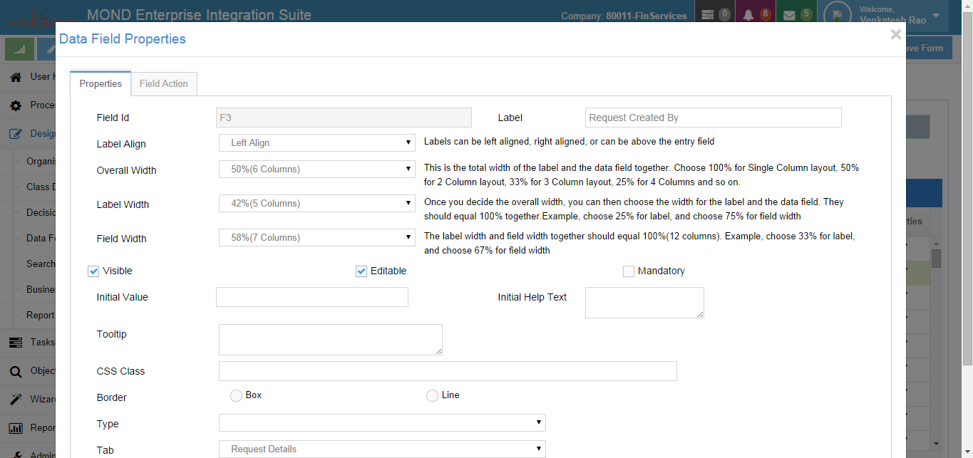
After adding all the form fields, you can define properties for each of the fields. The properties will allow you to define the tab and section in which the field has to appear, the width, placement of the field, etc.
In order to define the property for a field, click the Edit icon in the relevant row of the table. A Field Properties window will open.
You will notice that certain values are pre-populated by default. If you require changes, change the values, enter all the other properties and close the Properties window.
For drop down fields, radio buttons and Group Check boxes, you can select the enumeration that has to be used for displaying the values. The enumeration values can also be displayed from a code list defined on mondCloud Integration Platform. This is explained in FAQ section.


